CGS / BlueCherry
OBJECTIVE | BlueCherry has earned a prominent and positive brand position in the apparel/footwear/home goods manufacturing industries through the years as an effective and critical ERP/PLM solution for many globally recognized companies. BlueCherry leadership team wanted to refresh the brand which would include logo/identity redesign and redesign of all forward-facing assets in all media — printed datasheets/solution briefs, landing pages, ads, website presence, deck presentations and event campaigns. I was the hands-on designer as I lead all project components through their stages of development.
Exploratory concepts for BlueCherry logo redesign.
PROCESS | The first phase of the brand refresh process would be to establish a foundational style guide that would serve to provide visual consistency for the various marketing and sales enablement materials. I proposed layouts with sample treatments to the team which presented fonts, color palette, graphical shapes/proportions, and icon styles.
The next phase of the brand refresh would be to consistently apply the updated graphic standards to all marketing, sales enablement, and business communication materials. I was the hands-on graphic designer (and at times writer/editor) and managed out-of-house writers while collaborating with our internal stakeholders and marketing team.
• • • Proposed landing page concepts — reduce PDF view to 50% for correct proportions. • • •
In the BlueCherry Rebrand Proposal, I also developed nomenclature with icon associations for the suite of BlueCherry products. We needed to communicate the concept that any module (product) could be used as an independent solution or the products can be combined and integrated with each other to provide a comprehensive enterprise solution for supply chain management and product lifecycle manufacturing.


RESULTS | Through better messaging & design, streamlining processes, and engaging lead generation campaigns, the brand refresh is an impactful success: 10+% increase in YoY leads with 20% decrease in marketing costs. Increase in average deal size. ~10%.
General Electric
OBJECTIVE | The GE Security division needed to integrate new company-wide design standards for all marketing communication materials as well as specific solutions designed for unique marketing requirements.
AUDIENCE | Business to business — directors and managers charged with physical security. Also consumer security products for home and property.
PROCESS | I lead the design team who developed branded templates for over 25 different types of materials including: print advertising, direct mail, brochures, specification sheets, packaging, email campaigns, PowerPoint presentations, and online animated banners.
We delivered an extensive annotated graphic standards guide to ensure brand consistency across all GE Security products, promotions and communications. I also worked as hands-on designer for many of the materials.
RESULTS | The GE company-wide branded look & feel was consistently carried out throughout all online and printed marketing and advertising materials for all Security division products. The graphic standards guide ensured the longevity of the branding for GE internal designers as well as contracted agencies.
BlueVolt


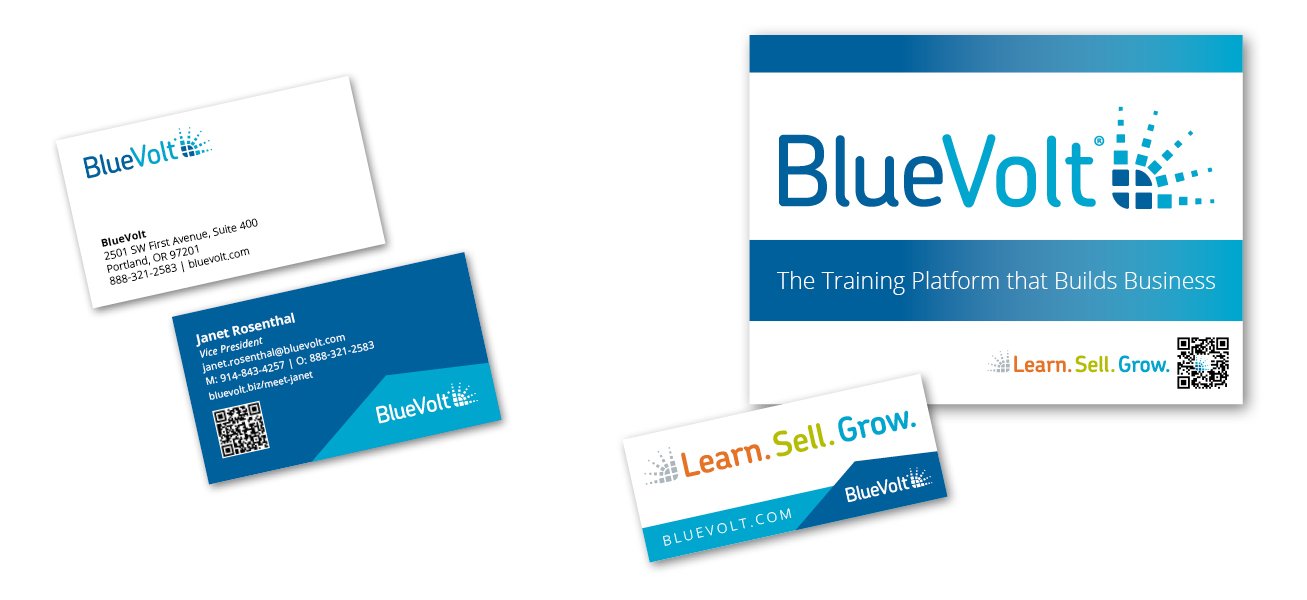
BACKGROUND | BlueVolt’s solution is an online learning platform (SaaS LMS) targeted to the trades industry. With new leadership on board, they wanted to evolve the brand for the company and the products they offered. Objectives included making the brand more contemporary and engaging for B2B products as well as end users.
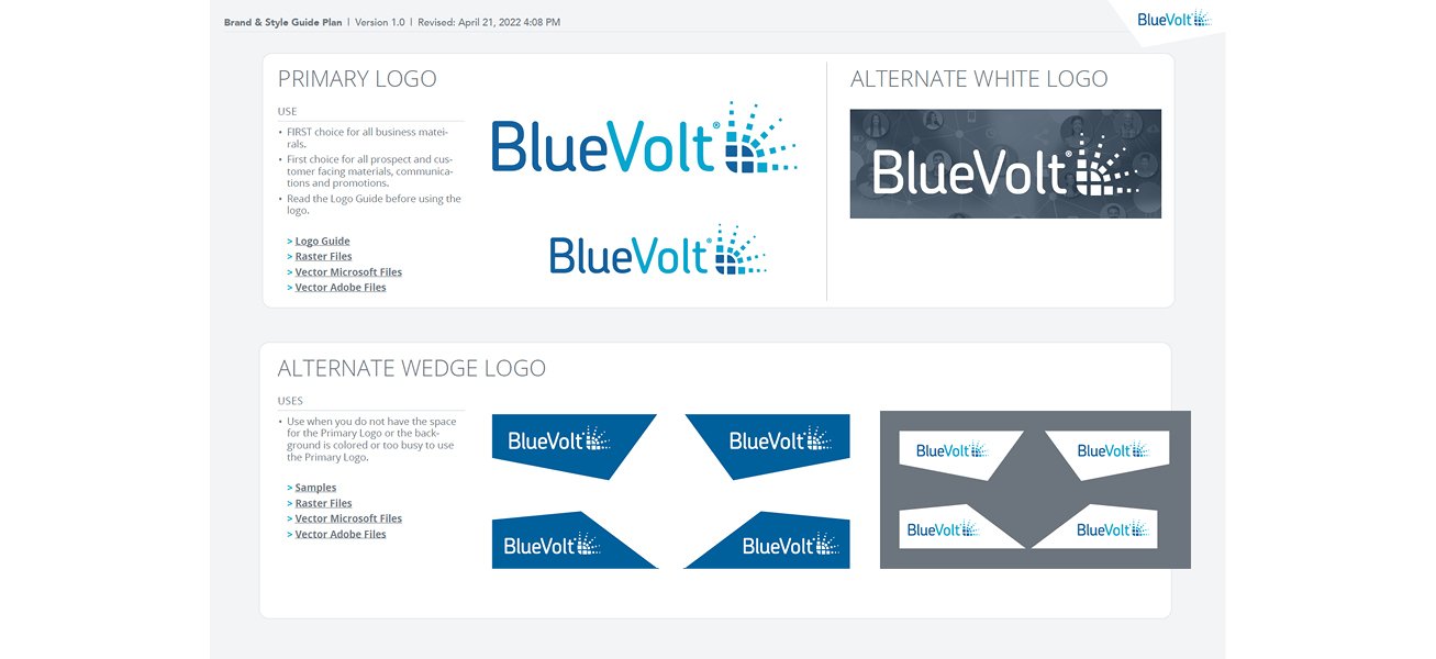
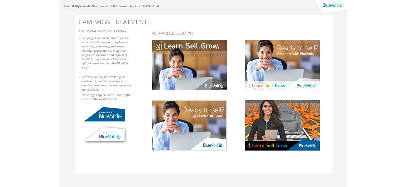
SOLUTIONS | I updated the brand look & feel with a new style guide and templates — colors, fonts, images, icons and illustrations that would be used across all marketing media. All marketing assets were redesigned with new graphical & written content including print & online advertising, event booths, sales team materials, email & e-newsletter campaigns, and more.
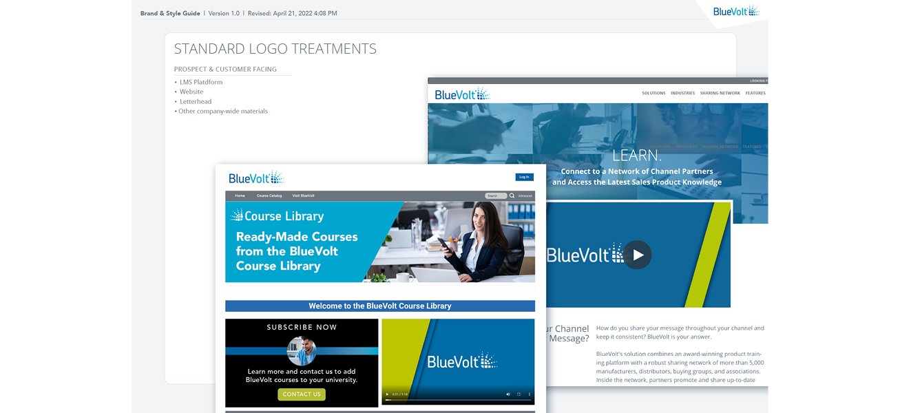
I also redesigned the company website from the ground up. The site is strategically designed as part of the marketing funnel to convert prospects to sales leads with landing pages for each target persona/audience.
RESULTS | As the company became more recognizable & memorable with the new campaigns (email, events & advertising), website conversions (request for demo with sales associate) more than tripled and had consistent growth quarter over quarter. BlueVolt Video.
• • • Screenshots | BlueVolt Brand Guide • • •


Smarsh


BACKGROUND | Smarsh provides SaaS email archiving and compliance services. Audience is B2B financial and enterprise companies. As Creative Director and the primary graphic designer at Smarsh for almost five years, I was responsible for company-wide rebranding and design support for all marketing initiatives.
SOLUTIONS | Solution development included logo redesign with corporate identity graphic standards, print & online promotions, tradeshows, sales team materials, product interface design (see UX/UI Design), direct mail and advertising campaigns.
Additionally, we overhauled the company website. I lead brainstorm and design strategy with senior staff and graphic designers to arrive at a solution that fulfilled marketing objectives and was enjoyable and educational for users.
RESULTS | Smarsh has been recognized/awarded with being one of the fastest growing companies in the Pacific Northwest and listed by Fortune 500 as a fastest growing tech company.
IMSI


BACKGROUND | IMSI (software publisher) was the fastest growing high-tech company in America — 23M to 60M during the three years I was with them as Senior Creative Services Manager. The company needed to build an in-house, fast and responsive creative department to accommodate its growth and take advantage of market opportunities. Audience is consumer — international and domestic.
SOLUTIONS | I built and lead the 18 person creative department and designed the templates and specifications (graphic standards) used by staff to ensure design consistency for the retail software product lines (over 35 titles/different products) which became international top brands including: MasterClips, TurboCAD, EZ Language, and WinDelete. My team pushed the limits of production techniques for package design. Bold graphics combined with clear marketing messages made the combination that would set new standards in the software packaging industry.
My department was also responsible for brand design of all business communication and promotional material including: domestic and international trade show booths, brochures, promotional sheets, direct mail campaigns, posters, and website.
RESULTS | The MasterClips product line grew from 500K/yr business to 10M/yr in three years — the revamped package design and re-branding is credited to a large degree for this success. The outstanding sales of TurboCAD and all the other products with re-banded and newly designed packaging contributed to IMSI's remarkable growth.


